We got new threads!
After 43 years "wearing" the same company logo, it is finally time to get some new updated threads. And it's only fitting with the 2nd generation of Murphys taking over.
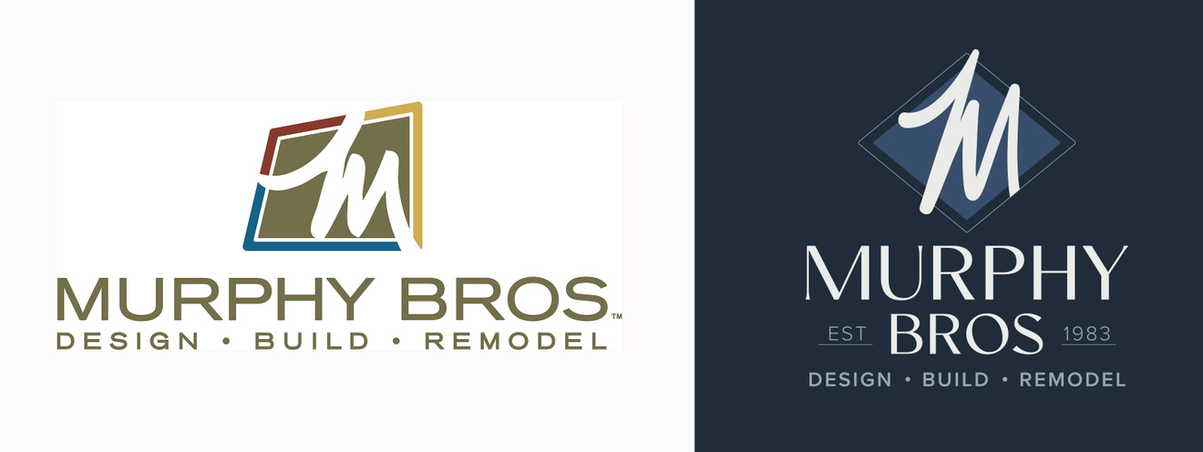
time for a "glow-up"!
The "M" stays
What we’re unveiling is not a new name, nor is it a new identity. It’s merely a new way of expressing this identity we’ve built together. The old logo has served us well, but after 43 years, it was starting to look like the visual equivalent of dial-up internet, or that 80’s kitchen we spent so much time remodeling.
This new visual identity was designed to reflect what this team of professionals is really all about—uber-talented, design-forward, detail-obsessed, and fueled by equal parts caffeine, inspiration, and determination.
Regarding our equally talented paint and pre-finishing pros, their new look is different, and the name has been shortened to its essential elements.
Who we are has not changed one bit
What's in a name?
William Shakespeare, Romeo and Juliet, Act II, Scene II, said, “What’s in a name? That which we call a rose by any other name would smell as sweet.” In other words: labels change, essence doesn’t. And that is the underlying message we wanted to share about this brand upgrade.
This change signals we are stepping into a new era of leadership. Founder John Murphy, who has created an exceptional design/build enterprise over these last four decades, is stepping back as his son Ben steps forward into the new role as owner and president of Murphy Bros.
Special thanks to Tara Jenkins Designs for her masterful work in updating our brands.