2026 Tile Trends for Minneapolis and Twin Cities Homeowners
From creamy beige calm to biophilic concrete, playful pastels, and jewel-toned maximalism—explore the four tile directions defining 2026.
Tile trends from Ceramic Tile works
Understand the trend in 4 moods
If design trends had a group chat, 2026 would be the year everyone agrees to be calm… and then immediately posts something dramatic in burgundy. Human nature, baby! This is a quick unpack of the trends covered in the latest style guide from Ceramic Tiles works, a long-time supplier.
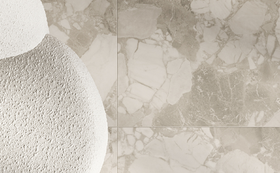
the mood is called serene
Serene—Beige is back
And it's not apologizing!
But “serene” doesn’t mean flat. The key is texture and material-mixing:
- Sedimentary-inspired surfaces (think shellstone-like fine texture and ceppo di gré-style inclusions) for organic depth
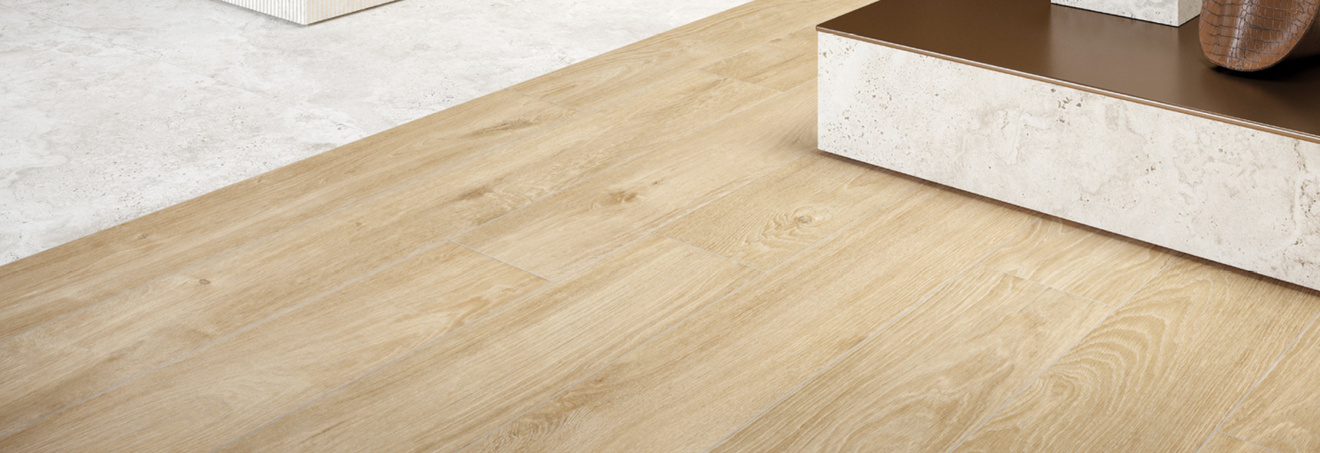
- Natural wood looks, dimensional decos, and soft matte wall tiles to keep the palette interesting without breaking the calm
So, if you are still in the observation mode and your kitchen feels cramped after the holidays or your mudroom seems to be always more mud than room, that’s valuable information to note. Start a list. Ask yourself why it’s not working. And keep asking why until you get to the bottom of it.
You may find out you just have a slob for a spouse or normal kids that need extra direction and less screen time. The goal isn’t to rush into design, but to build clarity. A remodel grounded in absolute honesty saves time, money, and stress later.
Metropolitan
Sleek Urban-industrial gets a comfort upgrade
“Sleek” is still metropolitan—but less harsh, more human. The guide describes the urban-industrial aesthetic evolving toward comfort via biophilic design, using:
- Organic stone finishes
- Sleek resin surfaces
A more refined, modern-concrete look (pebbled, softened—less “abandoned warehouse,” more “boutique hotel lobby”). The guide also notes that as the “serene organic” trend leans beige, cool-toned stones are re-emerging to balance neighboring metal and concrete looks.
And just in case you thought “comfort” meant “boring,” the guide specifically calls out bold black-and-white contrast, burgundy accents, and dimensional finishes as the drama lever.
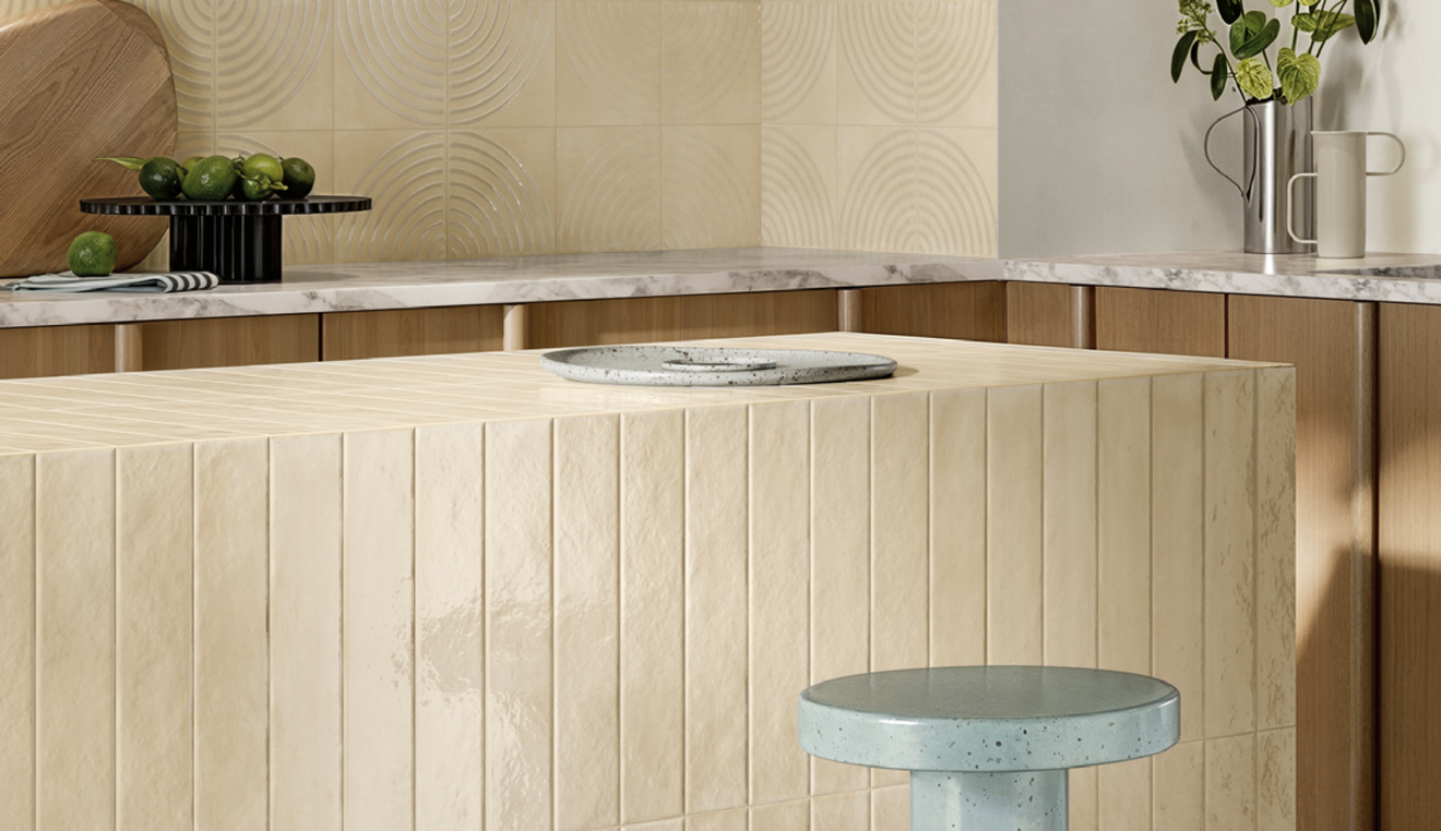
use your imagination—or ours!
Fun Pastels, pattern, and a little bit of “why not?”
For a whimsical interior, the guide basically gives a recipe:
- Start with warm wood tones + creamy off-white walls
- Add a pastel tile
- Sprinkle in colorful resin accents
- Bonus points for checkerboard
- Finish with a glossy + matte mix for tactile contrast
With light tones dominating at Cersaie, the guide notes pastels continue to steal the spotlight, and it contrasts the season’s more “chic” beige-with-burgundy vibe with its “fun-loving sister”: a pastel base plus crisp white accents.
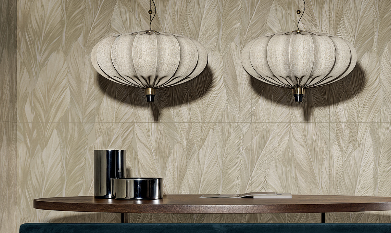
wall paper is in
Bold Wallpaper-look tile, marble moments, and jewel-tone energy
If beige and pastels aren’t your thing, the guide’s answer is: go bold, but go sophisticated.
It highlights how wallpaper-look tile is evolving through advanced production—bringing in dimensional glazes, metallic accents, and layered textures.
2026-Style-Guide-Vol-1-Digital-…
That eclectic, dressed-up surface trend pairs naturally with marble looks, which the guide says took center stage at Cersaie—from pristine whites to moody dramatic tones, including a wide range of marble mosaics.
No time like the present
Download the guide
The guide closes with a Frank Lloyd Wright reminder that feels especially relevant when you’re choosing finishes:
“Form and function should be one, joined in a spiritual union.”